15 Trendy Kitchen Cabinet Color Ideas for Every Style
I love how a fresh coat of paint on kitchen cabinets can completely change a room. It’s like giving your kitchen a new personality!
Cabinets take up so much visual space, so their color sets the tone for the entire kitchen. Whether you’re craving a bold, trendy vibe or a timeless, cozy feel, the right color makes all the difference.

In this guide, I’m sharing 15 kitchen cabinet color ideas to spark your inspiration. I’ve got options for every style—modern, farmhouse, classic, you name it. Plus, I’ll throw in practical tips to help you choose and pull off your dream kitchen.
Ready to dive in? Let’s explore!
Table of Contents
- Factors to Consider When Choosing Kitchen Cabinet Colors
- 15 Kitchen Cabinet Color Ideas
- Styling Tips for Kitchen Cabinet Colors
- Practical Considerations and Tips
- FAQs on Kitchen Cabinet Colors
- Conclusion
Factors to Consider When Choosing Kitchen Cabinet Colors
Before I jump into the colors, let’s talk about what to keep in mind. Choosing a cabinet color isn’t just about what looks pretty. It’s about what works for your space and lifestyle. Here’s what I consider when picking a color.
Kitchen Size and Lighting
I’ve learned that color can trick the eye. Light colors like white or soft gray make small kitchens feel bigger and brighter. They reflect light, opening up the space. Dark colors, like navy or charcoal, add drama but can make a small kitchen feel cramped. If your kitchen gets lots of natural light, you’ve got more flexibility. Low-light kitchens? Stick with lighter shades to avoid a cave-like vibe.
Style and Theme
Your kitchen’s style matters. I’m a sucker for a modern, sleek look, so I lean toward matte black or soft gray. If you love farmhouse charm, sage green or creamy ivory might call your name. Traditional kitchens shine with warm beige or classic white. Think about the vibe you’re going for—cozy, bold, minimalist—and choose a color that fits.
Complementary Elements
Cabinets don’t live alone. I always think about how they’ll play with countertops, backsplashes, and flooring. White cabinets pop against dark granite counters. Navy cabinets love a crisp white subway tile backsplash. Pick a color that harmonizes with these elements for a cohesive look.
Resale Value
If you’re planning to sell your home someday, neutral colors are safer. I know, bold colors are fun, but white, gray, or beige appeal to more buyers. That said, don’t be afraid to go bold if it’s your forever home. It’s your space, after all!
Maintenance
Let’s be real—kitchens get messy. Light colors like white show dirt and smudges faster. Dark colors like black can highlight fingerprints or scratches. I’ve found medium tones, like sage green or slate blue, hide wear better. Think about how much cleaning you’re willing to do.
15 Kitchen Cabinet Color Ideas
Now, the fun part! Here are 15 cabinet color ideas I’m obsessed with. Each one comes with details on why it works, how to style it, and its pros and cons. Let’s get inspired!
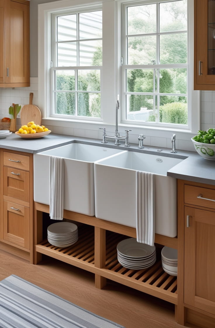
1. Classic White

I can’t go wrong with classic white cabinets. They’re crisp, clean, and timeless. White cabinets brighten any kitchen, making it feel airy and spacious. They’re like a blank canvas, letting you play with bold accents or keep things serene.
- Best For: Modern, coastal, or traditional kitchens. Perfect for small spaces or low-light rooms.
- Pairing Suggestions: I love white cabinets with marble countertops and gold hardware for a luxe look. A white subway tile backsplash keeps it classic. Try pale gray walls for a soft contrast.
- Pros: Universal appeal. Easy to refresh with new hardware or accents. Makes rooms feel bigger.
- Cons: Shows dirt, spills, and smudges easily. Needs regular cleaning.
- Example Use Case: I picture white cabinets in a bright coastal kitchen with blue accents and woven barstools. It’s fresh and inviting.
2. Soft Gray

Soft gray is my go-to for a modern, sophisticated vibe. It’s neutral but not boring, balancing warm and cool tones. It’s perfect if you want something subtler than white but still versatile.
- Best For: Minimalist or industrial kitchens. Works in medium to large spaces.
- Pairing Suggestions: Pair with white quartz countertops and chrome handles for a sleek look. I’d add a bold navy backsplash for contrast. Light blue walls keep it airy.
- Pros: Hides smudges better than white. Feels contemporary and calm.
- Cons: Can feel cold without warm accents like wood or brass.
- Example Use Case: I see soft gray cabinets in a minimalist kitchen with open shelving and concrete floors. It’s clean and trendy.
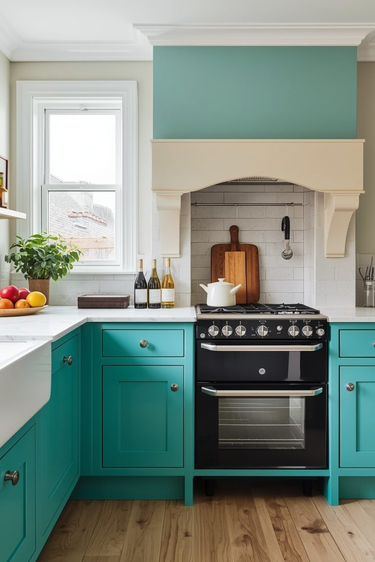
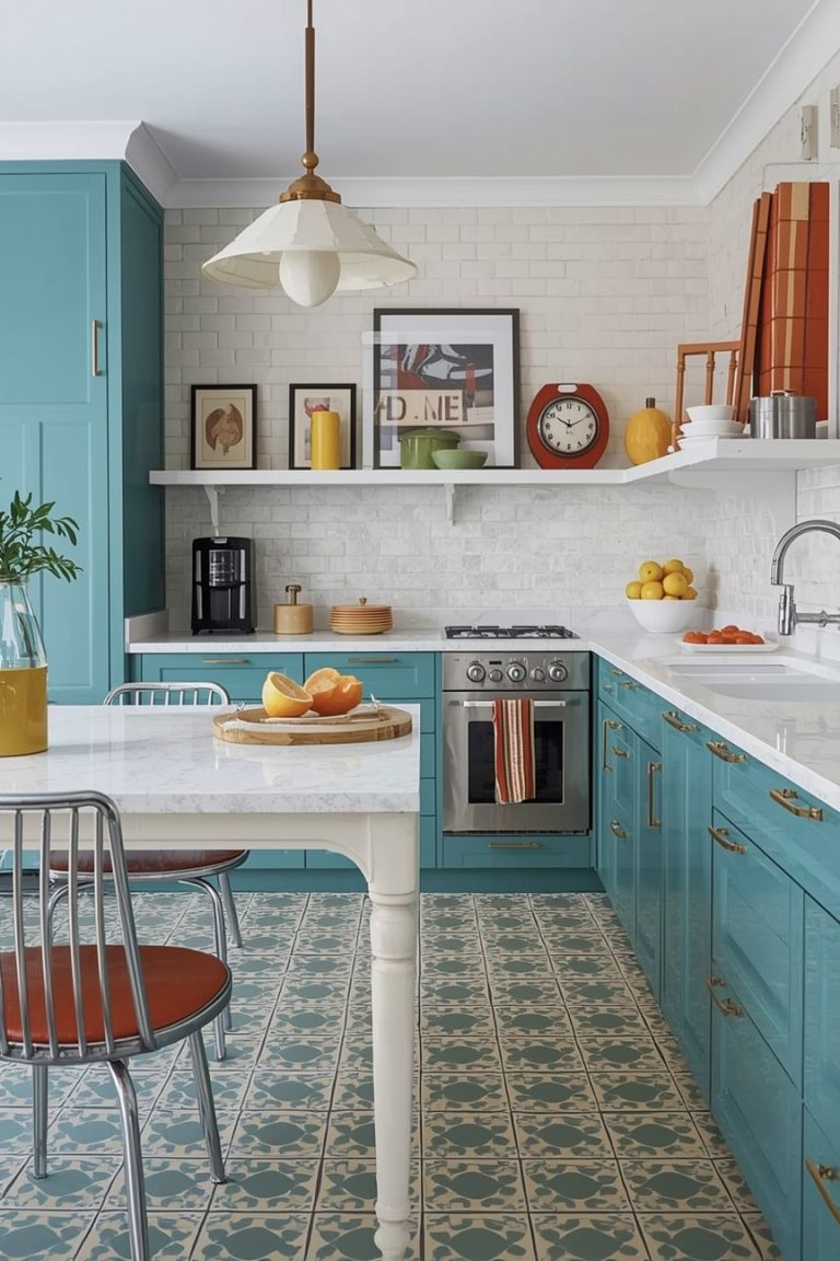
3. Navy Blue

Navy blue cabinets make my heart skip a beat. They’re bold yet elegant, adding depth and richness. Navy feels luxurious but not overwhelming, especially in larger kitchens.
- Best For: Contemporary or coastal designs. Ideal for well-lit or spacious kitchens.
- Pairing Suggestions: I’d pair navy with white countertops and brass knobs for a nautical vibe. A herringbone backsplash adds texture. Light gray walls balance the darkness.
- Pros: Rich contrast. Trendy yet timeless. Makes a statement.
- Cons: Can darken small or poorly lit kitchens. Shows dust more than lighter colors.
- Example Use Case: Navy cabinets shine in a modern kitchen with white walls and gold pendants. It’s chic and bold.
4. Sage Green

Sage green cabinets feel like a hug from nature. They’re calming and earthy, perfect for a cozy, inviting kitchen. This color is unique but still soft enough to feel approachable.
- Best For: Farmhouse or bohemian kitchens. Great for medium-sized spaces.
- Pairing Suggestions: I love sage green with butcher block countertops and matte black hardware. A white tile backsplash keeps it fresh. Beige walls add warmth.
- Pros: Soothing and unique. Hides minor smudges well.
- Cons: Less universal for resale. May not suit ultra-modern spaces.
- Example Use Case: Sage green cabinets in a farmhouse kitchen with woven rugs and wooden accents feel warm and homey.
5. Charcoal Black

Charcoal black cabinets are dramatic and modern. They scream high-end luxury and make a kitchen feel sleek. This color is bold but surprisingly versatile.
- Best For: Large, well-lit modern or industrial kitchens.
- Pairing Suggestions: Pair with concrete countertops and silver hardware for an urban edge. A white backsplash brightens the space. Gray walls keep it cohesive.
- Pros: Bold statement. Hides wear and tear well.
- Cons: Overwhelming in small kitchens. Shows fingerprints easily.
- Example Use Case: Charcoal cabinets in a spacious modern kitchen with stainless steel appliances look straight out of a design magazine.
6. Warm Beige

Warm beige cabinets are cozy and inviting. They’re a softer neutral than white, adding warmth without being too bold. I love them for classic, lived-in kitchens.
- Best For: Traditional or rustic kitchens. Works in any size space.
- Pairing Suggestions: Pair with granite countertops and bronze hardware for a timeless look. A cream backsplash blends seamlessly. Soft yellow walls enhance the warmth.
- Pros: Warm and forgiving for dirt. Feels homey.
- Cons: Less trendy than bold colors. Can feel dated in modern spaces.
- Example Use Case: Beige cabinets in a rustic kitchen with wooden beams and terracotta floors feel like a countryside retreat.
7. Forest Green

Forest green cabinets are deep and luxurious. They bring the outdoors in, creating a rich, grounded vibe. This color feels elegant and unexpected.
- Best For: Eclectic or traditional kitchens. Best in larger spaces.
- Pairing Suggestions: I’d pair forest green with soapstone countertops and gold accents. A patterned tile backsplash adds flair. Off-white walls keep it balanced.
- Pros: Unique and elegant. Makes a bold statement.
- Cons: Darkens rooms. Not as versatile for resale.
- Example Use Case: Forest green cabinets in a traditional kitchen with brass chandeliers feel like a stately manor.
8. Blush Pink

Blush pink cabinets are playful and charming. They add a soft, feminine touch without being too loud. I love how unexpected this color is in a kitchen.
- Best For: Retro or eclectic small kitchens. Adds fun to cozy spaces.
- Pairing Suggestions: Pair with white quartz countertops and rose gold hardware for a dreamy look. A geometric backsplash adds edge. Pale gray walls keep it modern.
- Pros: Fun and unique. Brightens small spaces.
- Cons: Niche appeal. May not age well.
- Example Use Case: Blush pink cabinets in a retro kitchen with checkerboard floors are pure whimsy.
9. Slate Blue

Slate blue cabinets are cool and calming. They’re a softer take on navy, offering serenity with a coastal twist. This color feels fresh and approachable.
- Best For: Coastal or Scandinavian kitchens. Works in most spaces.
- Pairing Suggestions: Pair with white oak countertops and nickel hardware for a beachy vibe. A white backsplash keeps it crisp. Light blue walls enhance the calm.
- Pros: Versatile and serene. Easy to style.
- Cons: Can blend into backgrounds if not accented well.
- Example Use Case: Slate blue cabinets in a Scandinavian kitchen with blonde wood accents feel airy and relaxed.
10. Mustard Yellow

Mustard yellow cabinets are vibrant and cheerful. They add energy and personality, perfect for a lively kitchen. This color is bold but warm.
- Best For: Retro or bohemian designs. Best in well-lit spaces.
- Pairing Suggestions: Pair with black countertops and brass handles for contrast. A white brick backsplash adds texture. Neutral walls let the cabinets shine.
- Pros: Uplifting and bold. Makes a statement.
- Cons: Polarizing. Trends may fade.
- Example Use Case: Mustard yellow cabinets in a bohemian kitchen with colorful rugs feel like a sunny escape.
11. Creamy Ivory

Creamy ivory cabinets are warm and elegant. They’re softer than white, with a touch of richness. I love them for classic, timeless kitchens.
- Best For: Classic or French country kitchens. Works in any size space.
- Pairing Suggestions: Pair with marble countertops and antique brass hardware for sophistication. A beige backsplash blends beautifully. Soft gray walls add depth.
- Pros: Timeless and forgiving. Feels luxurious.
- Cons: Shows wear over time. Less bold than trendy colors.
- Example Use Case: Ivory cabinets in a French country kitchen with chandeliers and linen curtains feel effortlessly chic.
12. Terracotta

Terracotta cabinets are warm and earthy. They evoke Mediterranean or Southwestern vibes, adding soul to a kitchen. This color feels grounded and unique.
- Best For: Rustic or Spanish-style kitchens. Best in warm climates.
- Pairing Suggestions: Pair with travertine countertops and wrought iron hardware for authenticity. A mosaic tile backsplash adds artistry. Cream walls keep it light.
- Pros: Unique and warm. Feels artisanal.
- Cons: Limited style fit. Not as versatile.
- Example Use Case: Terracotta cabinets in a Spanish-style kitchen with arched doorways feel like a villa.
13. Matte Black

Matte black cabinets are sleek and minimalist. They’re ultra-modern, with a cool, edgy vibe. I love how they make a kitchen feel like a showroom.
- Best For: Urban or industrial kitchens. Best in large spaces.
- Pairing Suggestions: Pair with stainless steel countertops and black hardware for a monochrome look. A white subway tile backsplash adds contrast. Gray walls keep it sleek.
- Pros: Edgy and low maintenance. Feels high-end.
- Cons: Fingerprint magnet. Can feel stark.
- Example Use Case: Matte black cabinets in an urban loft kitchen with exposed brick feel effortlessly cool.
14. Teal

Teal cabinets are vibrant and coastal. They balance bold energy with calming vibes, making them a fun yet soothing choice. This color pops without being overwhelming.
- Best For: Eclectic or coastal kitchens. Great for medium spaces.
- Pairing Suggestions: Pair with white countertops and silver accents for a fresh look. A glass tile backsplash adds sparkle. Pale aqua walls enhance the vibe.
- Pros: Eye-catching and fresh. Feels playful.
- Cons: Trend-dependent. May not suit traditional spaces.
- Example Use Case: Teal cabinets in a coastal kitchen with rope accents and driftwood feel like a beach house.
15. Two-Tone (White Upper, Navy Lower)

Two-tone cabinets are dynamic and modern. I love combining white uppers and navy lowers for visual interest. This look feels fresh and balanced.
- Best For: Contemporary or transitional kitchens. Works in most spaces.
- Pairing Suggestions: Pair with neutral quartz countertops and mixed-metal hardware (gold and silver). A white backsplash keeps it clean. Light gray walls tie it together.
- Pros: Versatile and trendy. Adds depth.
- Cons: Requires careful coordination. Can feel busy if overdone.
- Example Use Case: Two-tone cabinets in a transitional kitchen with sleek pendants feel modern yet approachable.
Styling Tips for Kitchen Cabinet Colors
Now that you’ve got color ideas, let’s talk styling. I’ve learned a few tricks to make your cabinets shine. Here’s how to elevate your chosen color.
Hardware Choices
Hardware is like jewelry for your cabinets. I love gold or brass for warm colors like sage green or terracotta. Chrome or nickel suits cool tones like slate blue or soft gray. Matte black hardware adds edge to bold colors like mustard yellow. Mix metals for a modern twist, but keep it subtle.
Backsplash and Countertops
Your backsplash and countertops should complement your cabinets. I pair white cabinets with marble or quartz for elegance. Navy cabinets pop against a white subway tile backsplash. For unique colors like teal, try a glass or mosaic tile backsplash. Butcher block counters warm up sage green or beige cabinets.
Wall Colors
Wall colors set the mood. I keep walls neutral (white, gray, Beige) for bold cabinet colors like navy or forest green. For neutral cabinets like white or ivory, a soft pastel wall (light blue, pale yellow) adds warmth. Avoid matching walls to cabinets—it can feel flat.
Lighting
Lighting highlights your cabinets’ beauty. I love under-cabinet lighting to make colors pop at night. Pendant lights in brass or glass add flair above islands. For dark cabinets like charcoal, ensure ample overhead lighting to avoid a gloomy vibe.
Open Shelving
Open shelves break up solid cabinet blocks. I use them to display dishes or plants, adding texture. For bold cabinets like mustard yellow, keep shelves neutral (white or wood). For neutral cabinets like soft gray, add colorful accents on shelves.
Mixing Finishes
Mixing finishes adds depth. I love matte cabinets with glossy hardware for contrast. Distressed finishes suit rustic colors like terracotta. Glossy cabinets in colors like navy or matte black feel ultra-modern. Experiment, but don’t overdo it.
Practical Considerations and Tips
Choosing a color is exciting, but let’s get practical. Here’s how to make your vision a reality without stress.
Budget Options
New cabinets can be pricey. I’ve saved money by painting existing cabinets instead. A good primer and quality paint can transform old cabinets for a fraction of the cost. If replacing, look for budget-friendly brands or semi-custom options.
DIY vs. Professional
I’ve tried DIY cabinet painting, and it’s doable with patience. Sand, prime, and use a foam roller for a smooth finish. But for complex colors or large kitchens, I’d hire a pro. They ensure a flawless, durable result, saving time and frustration.
Durability
The right finish matters. I prefer lacquer for a sleek, durable look. Matte finishes hide scratches but can be harder to clean. Semi-gloss is a happy medium—easy to wipe down and long-lasting. Ask your paint store for kitchen-specific options.
Cleaning Tips
Light cabinets like white need regular wiping to stay pristine. I use a mild soap and water mix. Dark cabinets like navy show dust, so dust them weekly. For tough stains, a magic eraser works wonders—just test it first.
Testing Colors
Never skip testing. I grab sample pots and paint a small cabinet door. Live with it for a few days to see how it looks in different lights. Peel-and-stick swatches are another easy way to preview colors.
FAQs on Kitchen Cabinet Colors
I get lots of questions about cabinet colors. Here are answers to the most common ones.
What are the most timeless cabinet colors?
White, soft gray, and creamy ivory are my go-to timeless picks. They suit any style and appeal to buyers. Navy is also gaining staying power for its classic yet bold vibe.
How do I choose a color for a small kitchen?
Stick with light colors like white, soft gray, or blush pink. They make the space feel bigger and brighter. Avoid dark colors like charcoal unless you have tons of natural light.
Can I mix different cabinet colors in one kitchen?
Absolutely! Two-tone cabinets, like white uppers and navy lowers, are trendy. Just ensure the colors complement each other. Keep countertops and walls neutral to avoid chaos.
What colors increase home resale value?
Neutral colors like white, gray, and beige are safest for resale. They appeal to a wide range of buyers. Bold colors can work if they’re tasteful and suit the home’s style.
How often should I repaint or update cabinet colors?
With quality paint and care, cabinets can last 5–10 years before needing a refresh. Repaint sooner if trends change or wear shows. Regular cleaning extends their life.
Are bold colors like teal or yellow a good idea for cabinets?
Bold colors are great if you love them! They add personality and joy. Just know they may not suit every buyer or trend. Test them first and balance with neutral accents.
Conclusion
I hope these 15 kitchen cabinet color ideas have sparked your creativity! From classic white to vibrant teal, there’s a color for every style and mood. I love how cabinets can transform a kitchen, making it feel fresh, cozy, or bold.
As you plan, balance your personal taste with practical factors like lighting, maintenance, and resale value. Start by testing swatches or sketching your ideas.
If you’re feeling stuck, a designer can help bring your vision to life—or drop a comment below, and I’ll chime in! Ready to give your kitchen a glow-up? Grab that paintbrush and make it yours!

Emily Harper is a kitchen decor expert and interior designer with a passion for creating stylish, functional spaces. As a busy mom, she understands the importance of a kitchen that works for both family life and design. With 6 years of experience, Emily specializes in transforming kitchens into inviting, practical spaces. She’s known for her ability to blend trends with everyday needs, helping families create kitchens that feel like the heart of the home.