15 Stunning Fall Color Palettes to Warm Up Your Home Décor
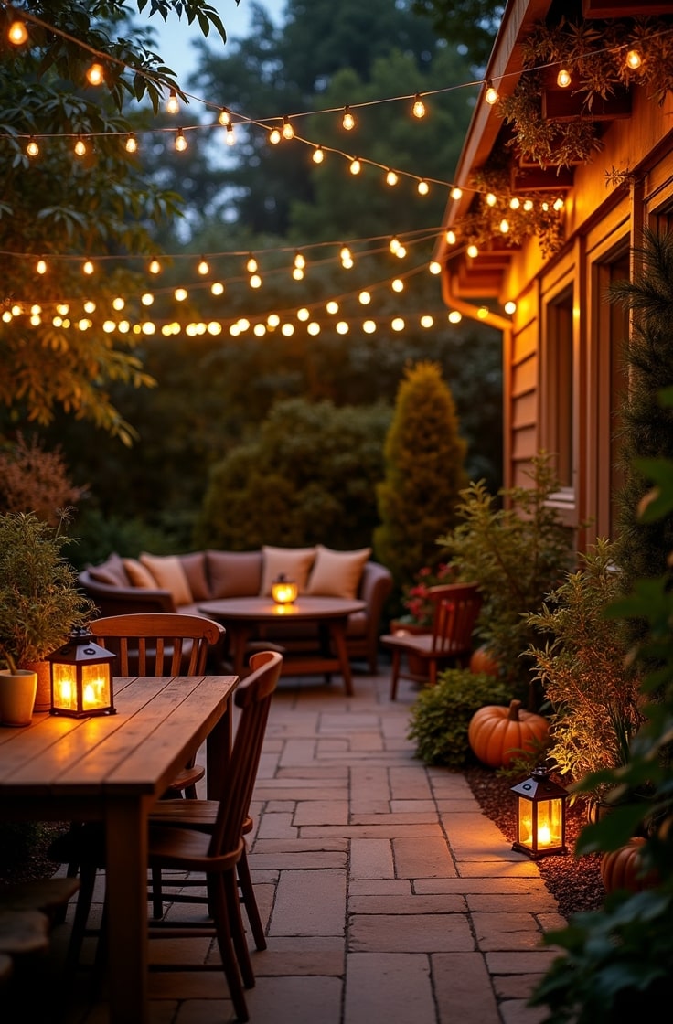
Fall brings a shift in color that’s hard to ignore—bold reds, warm golds, deep browns. These tones aren’t just seasonal; they’re powerful tools for creating mood and style.
Whether you’re decorating your home, working on a design project, or planning seasonal content, choosing the right color palette can make all the difference.

As someone who works with color and styling daily, I’ve curated 15 fall color palettes that capture the essence of the season—no guesswork, just tested combinations that work.
Each palette is versatile, balanced, and rooted in the natural beauty of autumn. If you want to bring the warmth and richness of fall into your projects, these palettes are a smart place to start.
Table of Contents
- Understanding Fall Color Palettes
- The 15 Fall Color Palettes
- How to Use Fall Color Palettes
- Trends in Fall Color Palettes
- Conclusion
Understanding Fall Color Palettes
Fall color palettes are special. They’re inspired by nature’s transformation—think of vibrant leaves, golden harvests, and misty autumn mornings. These colors feel alive yet grounding, blending warmth and nostalgia in a way that’s hard to resist.
I’ve always found that fall hues have a unique ability to make spaces and designs feel welcoming.
From a color theory perspective, fall palettes lean heavily on warm tones like reds, oranges, and yellows. But they also include cooler shades like muted greens and soft grays to balance things out.
Neutral tones, like creamy beiges or deep browns, often act as the backbone, tying everything together. Each hue plays a role in creating that autumnal vibe.
Why do these colors resonate so deeply? It’s all about psychology. Warm tones like red and orange evoke energy and comfort, while earthy browns and greens ground us, reminding us of nature’s cycles.
Together, they create a sense of coziness and nostalgia—perfect for sipping hot cider or curling up by a fire.
These palettes aren’t just pretty; they’re versatile. You can use them in graphic design, interior decorating, fashion, weddings, or even branding. Whether you’re planning a fall wedding or redesigning your living room, there’s a palette here for you.
Let’s explore the 15 I’ve curated, each with its own personality and purpose.
The 15 Fall Color Palettes
I’ve crafted these palettes to capture the diversity of fall. Each one includes a name, a description, hex codes for easy use, the mood it evokes, and ideas for where it shines. Ready to get inspired? Here we go.
1. Harvest Sunset

Imagine a fall evening, the sky ablaze with oranges, reds, and golds. That’s Harvest Sunset. This palette combines rich oranges (#FF4500), deep reds (#8B0000), golden yellows (#FFD700), warm browns (#A0522D), and vibrant oranges (#FFA500). It’s bold and nostalgic, perfect for creating a warm, inviting vibe.
Mood: Warm, vibrant, nostalgic.
Uses: This palette screams fall weddings. Picture table settings with orange napkins and red centerpieces. It’s also great for branding—think a cozy bakery logo—or home interiors with sunset-inspired accent walls.
Hex Codes: #FF4500, #8B0000, #FFD700, #A0522D, #FFA500.
2. Pumpkin Spice

If fall had a flavor, it’d be Pumpkin Spice. This palette mixes earthy pumpkin oranges (#D2691E), creamy beiges (#FFF5E1), rich browns (#8B4513), sandy tones (#F4A460), and warm sienna (#A0522D). It’s like a warm latte in color form.
Mood: Comforting, inviting, rustic.
Uses: Perfect for cafe branding—think menus or signage. It also works in fall fashion (cozy sweaters, anyone?) or kitchen decor with orange dishware and beige linens.
Hex Codes: #D2691E, #F4A460, #8B4513, #FFF5E1, #A0522D.
3. Woodland Whisper

Step into an autumn forest with Woodland Whisper. This palette features forest greens (#228B22), bark browns (#4A3728), muted golds (#DAA520), olive tones (#6B8E23), and soft ivories (#F5F5DC). It’s serene and natural, like a quiet walk through the woods.
Mood: Serene, natural, grounding.
Uses: Ideal for eco-friendly branding or outdoor event decor, like a rustic baby shower. Try it in minimalist interiors with green throw pillows and wooden accents.
Hex Codes: #228B22, #4A3728, #DAA520, #6B8E23, #F5F5DC.
4. Crimson Orchard

Crimson Orchard is all about apple-picking days. It blends deep crimsons (#DC143C), apple reds (#B22222), soft creams (#FFF8DC), dark reds (#8B0000), and light corals (#F08080). It’s romantic yet bold, with an earthy charm.
Mood: Romantic, bold, earthy.
Uses: Use it for wedding invitations with crimson accents or editorial designs with striking red headlines. It’s also great for cozy textiles like red throw blankets.
Hex Codes: #DC143C, #B22222, #FFF8DC, #8B0000, #F08080.
5. Golden Harvest

Golden Harvest captures the glow of fall fields. Think warm golds (#FFD700), wheat yellows (#F5DEB3), rich browns (#8B4513), goldenrod (#DAA520), and tan (#DEB887). It’s cheerful and abundant, like a bountiful harvest.
Mood: Abundant, cheerful, rustic.
Uses: Perfect for Thanksgiving decor—think table runners and centerpieces. It’s also great for packaging design or rustic home accents like gold-framed mirrors.
Hex Codes: #FFD700, #F5DEB3, #8B4513, #DAA520, #DEB887.
6. Autumn Twilight

As day fades into night, Autumn Twilight emerges. This palette mixes deep purples (#4B0082), dusky blues (#483D8B), soft grays (#778899), slate blues (#6A5ACD), and lavender (#E6E6FA). It’s mysterious and sophisticated, perfect for evening vibes.
Mood: Mysterious, calming, sophisticated.
Uses: Try it for evening event decor, like a fall gala, or luxury branding with purple logos. It’s also stunning in moody interiors with gray walls and blue accents.
Hex Codes: #4B0082, #483D8B, #778899, #6A5ACD, #E6E6FA.
7. Spiced Chai

Spiced Chai is like your favorite fall drink. It features warm browns (#8B4513), creamy ivories (#FFF5E1), cinnamon reds (#A0522D), pumpkin oranges (#D2691E), and sandy beiges (#F4A460). It’s cozy and comforting, just like a warm mug.
Mood: Cozy, comforting, inviting.
Uses: Use it for cafe menus or fall fashion like scarves and boots. It’s also great for home textiles—think beige curtains with orange throw pillows.
Hex Codes: #8B4513, #FFF5E1, #A0522D, #D2691E, #F4A460.
8. Maple Glow

Maple Glow is all about vibrant maple leaves. It combines maple reds (#C71585), warm oranges (#FF4500), soft yellows (#FFD700), vibrant oranges (#FFA500), and tan (#CD853F). It’s energetic and festive, perfect for fall celebrations.
Mood: Energetic, warm, festive.
Uses: Ideal for fall festivals or graphic design with bold posters. It’s also great for seasonal marketing—think vibrant social media graphics.
Hex Codes: #C71585, #FF4500, #FFD700, #FFA500, #CD853F.
9. Rustic Barn

Rustic Barn evokes weathered farmhouses. It includes weathered grays (#808080), barn reds (#8B0000), soft creams (#FFF5E1), dark grays (#A9A9A9), and deep reds (#B22222). It’s timeless and charming, with a vintage feel.
Mood: Rustic, timeless, charming.
Uses: Perfect for farmhouse decor, like gray walls with red accents, or rustic wedding themes. It’s also great for vintage branding, like a craft brewery logo.
Hex Codes: #808080, #8B0000, #FFF5E1, #A9A9A9, #B22222.
10. Mulled Wine

Mulled Wine is rich and luxurious. It blends deep burgundies (#800020), plums (#4B0082), soft pinks (#FFC1CC), slate purples (#6A5ACD), and magenta (#C71585). It’s warm and elegant, like a glass of spiced wine.
Mood: Rich, luxurious, warm.
Uses: Use it for holiday decor, like table settings, or upscale fashion with plum dresses. It’s also stunning in elegant interiors with burgundy furniture.
Hex Codes: #800020, #4B0082, #FFC1CC, #6A5ACD, #C71585.
11. Frosty Dawn

Frosty Dawn captures cool fall mornings. It features cool grays (#D3D3D3), soft blues (#4682B4), creamy whites (#F5F5F5), light blues (#B0C4DE), and slate grays (#708090). It’s crisp and serene, perfect for a fresh start.
Mood: Crisp, serene, refreshing.
Uses: Ideal for minimalist design or winter-transition decor, like blue throw blankets. It’s also great for corporate branding with clean, professional vibes.
Hex Codes: #D3D3D3, #4682B4, #F5F5F5, #B0C4DE, #708090.
12. Amber Hearth

Amber Hearth is like a cozy fireplace. It includes warm ambers (#FF8C00), deep browns (#8B4513), vibrant oranges (#FFA500), pumpkin tones (#D2691E), and tan (#DEB887). It’s intimate and inviting, perfect for cozy spaces.
Mood: Warm, intimate, inviting.
Uses: Use it for living room decor, like amber cushions, or candle packaging. It’s also great for fall photography with warm, glowing tones.
Hex Codes: #FF8C00, #8B4513, #FFA500, #D2691E, #DEB887.
13. Mossy Trail

Mossy Trail takes you on a forest walk. It features olive greens (#6B8E23), earthy browns (#4A3728), muted yellows (#F0E68C), forest greens (#228B22), and light greens (#9ACD32). It’s tranquil and earthy, like nature itself.
Mood: Natural, tranquil, earthy.
Uses: Perfect for outdoor branding or nature-inspired decor, like green rugs. It’s also great for casual fashion, like olive jackets.
Hex Codes: #6B8E23, #4A3728, #F0E68C, #228B22, #9ACD32.
14. Harvest Moon

Harvest Moon glows with lunar magic. It blends soft yellows (#FFD700), deep oranges (#FF4500), charcoal grays (#2F4F4F), vibrant oranges (#FFA500), and dark grays (#696969). It’s mystical and elegant, perfect for night-time vibes.
Mood: Mystical, warm, elegant.
Uses: Use it for event decor, like a fall gala, or artistic projects with moonlit themes. It’s also great for evening wear with gray and orange accents.
Hex Codes: #FFD700, #FF4500, #2F4F4F, #FFA500, #696969.
15. Cozy Knit

Cozy Knit feels like your favorite sweater. It includes soft beiges (#F5F5DC), warm grays (#A9A9A9), muted reds (#B22222), light grays (#D3D3D3), and creamy ivories (#FFF5E1). It’s soft and approachable, perfect for comfort.
Mood: Cozy, soft, approachable.
Uses: Ideal for textile design, like throw blankets, or casual branding. It’s also great for home decor with beige furniture and red accents.
Hex Codes: #F5F5DC, #A9A9A9, #B22222, #D3D3D3, #FFF5E1.
How to Use Fall Color Palettes
Now that you’ve got these gorgeous palettes, how do you use them? It’s easier than you think. Start by balancing bold and neutral tones. For example, in the Harvest Sunset palette, use the vibrant orange (#FF4500) as an accent and the warm brown (#A0522D) as a base. This creates harmony without overwhelming the design.
I love using tools like Adobe Color, Canva, or Coolors to test palettes. They let you play with combinations and see how colors work together. You can input the hex codes I’ve provided and tweak them to suit your project. It’s like having a digital paint swatch!
Textures are your friend in fall designs. Pair these palettes with materials like wool, wood, or velvet for that cozy autumn feel. For example, the Woodland Whisper palette pairs beautifully with wooden furniture and green wool throws. It’s all about creating a tactile experience.
Don’t forget accessibility. If you’re designing for the web or print, ensure there’s enough contrast between colors. For instance, in the Frosty Dawn palette, pair the soft blue (#4682B4) with creamy white (#F5F5F5) for readable text. Tools like WebAIM’s Contrast Checker can help you nail this.
Trends in Fall Color Palettes
Fall 2025 is bringing some exciting trends. I’ve noticed a shift toward muted pastels paired with bold tones. Think soft pinks from the Mulled Wine palette (#FFC1CC) alongside deep burgundy (#800020). It’s a fresh take on classic fall hues.
Global cultures are influencing palettes too. Scandinavian design loves earthy tones like those in Woodland Whisper, while Indian autumn festivals embrace vibrant hues like Maple Glow. It’s inspiring to see how different cultures interpret fall’s beauty.
Sustainability is also big. More designers are using natural dyes and eco-friendly materials. The Mossy Trail palette, with its greens and browns, feels perfect for sustainable brands. Choosing colors that reflect nature’s palette can align your project with this eco-conscious trend.
Conclusion
Fall color palettes are like a love letter to autumn. They capture the season’s warmth, nostalgia, and beauty in a way that’s endlessly versatile.
Whether you’re drawn to the vibrant energy of Maple Glow or the serene calm of Frosty Dawn, there’s a palette here for every project. I encourage you to play with these colors, mix and match them, and see where your creativity takes you.
Share your creations online—I’d love to see how you bring fall to life! For more inspiration, check out fall design blogs or browse Pinterest for seasonal ideas.

Emily Harper is a kitchen decor expert and interior designer with a passion for creating stylish, functional spaces. As a busy mom, she understands the importance of a kitchen that works for both family life and design. With 6 years of experience, Emily specializes in transforming kitchens into inviting, practical spaces. She’s known for her ability to blend trends with everyday needs, helping families create kitchens that feel like the heart of the home.